
Colour
I have no idea how to analyse the colour patterns and how they blend or compliment each other. But we can look at the saturation of them.
| This rather horrible image shows
the colour saturation (from CurveMeister), where dark tones represent
little or no colour, and light when there is more saturation.
The image must have been quite heavily jpg compressed, because you can see squares of equal saturation. |
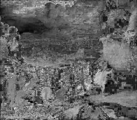 |
There seems to be a lot of small areas in the green bank that are really saturated which I do not understand. Viewing those points in detail show them to be almost pure cyan (a colour cast?) and read Hue 180degrees, Saturation 100, Brilliance 3 (in RGB terms 0,8,8)! So I think we can ignore them.
If we lay the saturation image over the original painting in luminosity mode, then it is more obvious where the saturated paint is. |
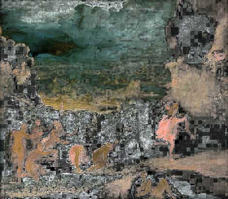 |
This seems to confirm the observation that the darker areas should be less saturated.
