 |
||
|
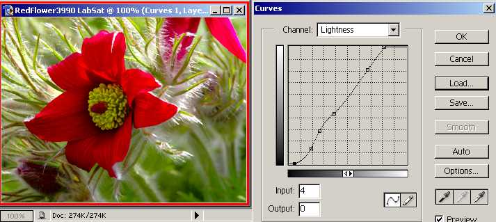
Ah, that's better, although a bit difficult to see at this small size (check it out on the big image later). But why have I got little wiggles and how did I decide where to place them? When you curve, a steep line will give more contrast (in that area), but you will have to have a shallower area to compensate - so it is a balancing act, trading off one range of tones for another. The next few pages show my reasoning... |
||
<Previous Next> |
||