
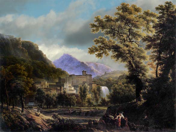
Tonal Structure
I had a bash at seeing if I could increase the mid-tone area of the image, but no-way.
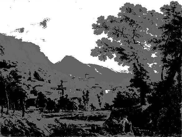
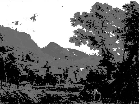
So we have an image in two halves - the bottom 2 stops and the top 2 stops. Although this should increase the contrast between the near and distant mountains (plus sky), it does not really jump out at you and there is this thin area of mid-tone between them - thus reducing the contrast step. Nothing really like the Abbate contrast - why? Well lets look at both images in grey-scales.
|
|
|
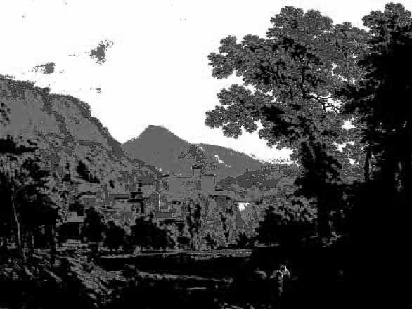
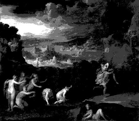
Amazing the difference - both the above images just have black, white and 3 shades of grey, no detail at all. So keep each object within a short tonal range with a jump at the edges and bingo there is tonal impact.
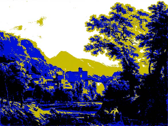
So what happens if we try and increase the tonal range contrast, by removing the mid-tone edges that separate the top and bottom 2 stops?
 |
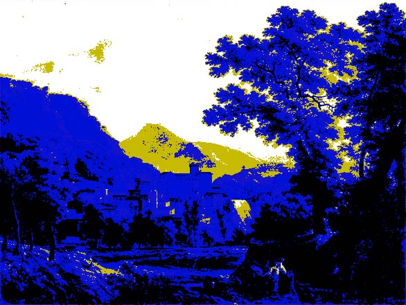 |
| Here I've merged the mid tone with the top 2 stops | and here with the bottom 2 stops - better contrast |
 |
 |
But when we convert this to grey-scale, there really is not much difference and tonally we are not getting any contrast impact. So if an image has broken areas of tonal range, we are never going to get any impact.
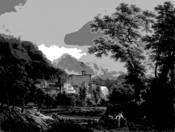
Can we create more contrast ranges and will it help? I'll add a few clouds, lighten the buildings and darken the left hills.
 |
 |
I believe this focuses the eye more and certainly the 5 grey-scale image now has form (compared to the above ones), but it does not seem possible to construct an image which leads the viewer's eye into the main subject (the buildings?) of the image.
![]()