
Comparison of Colour renditions
Hover your mouse over this image to see the difference between the two colour versions. If you want to revisit the B&W ones, then use the browser back button (not Return).
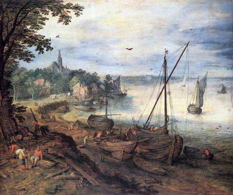
Well? I think the hover image in B&W has better tones, but the non-hover colour image is the sweeter one.
Three others agreed with me, and this reply nicely sums it up "Interestingly (or not!) I prefer the hover B+W, and the non-hover in the colour. It's an increase in contrast isn't it? And I like the increased contrast in the B+W because it brings out more of the detail, but in the colour it's too much - I like the subtly and blending of the colours with the less contrast".
But one person said "I would say the non-hover is the correct version for this particular image in both cases. I noted the loss of details in the ropes of the sailboats and was having trouble with the overall tones you lost in the shore areas as well. While it made a better 'line' drawing it was lacking in depth and feeling. While some could argue it is improved in Contrast and detail, I would argue that the lost tonality is a very bad thing".
The non-hover images, on both pages, are the originals (including the colour correction) and the hover ones are my corrections.
So the idea of trying to make a better B&W rendition to improve the tones in a colour image, does not necessarily improve it - particularly in this case. Why? I think because this image requires muted (gentle) tones - trying to do a Picture Postcard Workflow inspired correction was not the right thing to do to this image.
The moral of this exercise, is not to blindly follow advice because it is/maybe only correct in certain cases!
![]()