


Landscapes - End of Part 1 !
I had not thought, when I started this project, that I would find out so much - and only after analysing 5 paintings in any detail !
Coming from a scientific background, I had thought that one could reply on measurements to be able to analyse these master pieces. Perhaps I was too naive, or perhaps because I had not studied Art before, I had not appreciated that they had built on a wealth of observational experience that can not be easily measured and defined. There is a big gulf between science and art !
Before I draw any conclusion, especially from the last few diversions, there are a couple of images I played with which seem to capture the essence of what I have found.
Firstly the Green hue 'problem'.
It bugged me that the paintings did not have green leaves on their trees (and many of the other hues were 'wrong'), and I liked the confirmation from the Munsell Colour model, that we find green hues difficult to differentiate. I should have involved my father more, but alas he is not on the web - the chance remark that painters found green difficult to portray, confirms this Green problem.
We have seen from the Angle plot of Munsell against the Hue of the HSB colour space, that perception of hue changes varies across the spectrum. What would happen if we tried to change the hue range of an image to imitate the Munsell spacings? Actually I can not find an easy way to do this in Photoshop, but by playing with the Hue/Saturation controls I could move the hues a little, but not enough to properly align with Munsell.
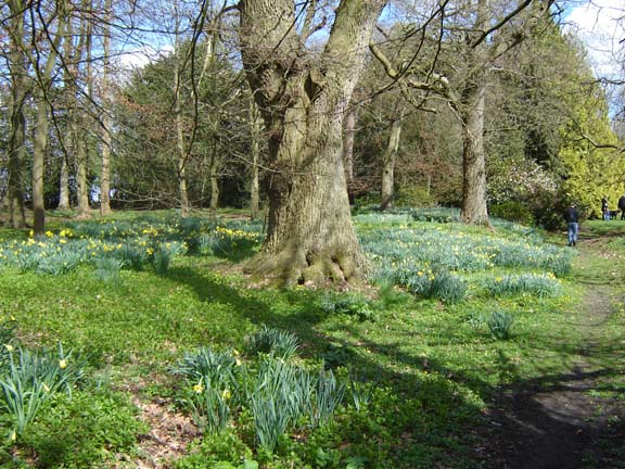
| Here is an out of camera photo of some
'greens'!
I'll only process this for colour saturation. |
 |
| This is my standard 'Lab Sat' action, which one would normally tone down rather a lot - as it it much too violent. | 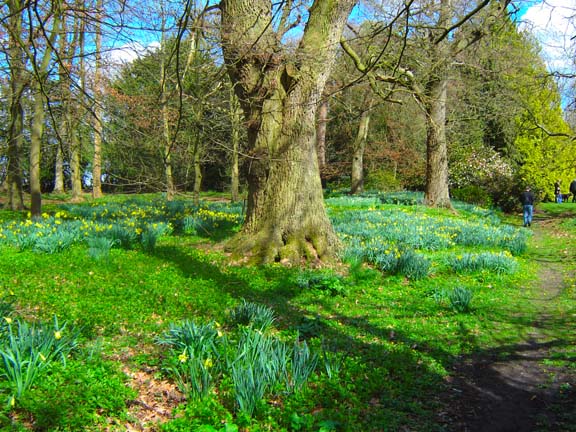 |
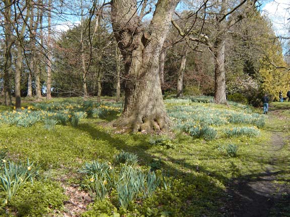
| But what if I tried to adjust the Hues to be
more in line with the Munsell perceived range?
The greens have now moved towards the yellow range by well over 20 degrees, without upsetting the blues too much. One would perhaps say the image looks a little drab - but it is still acceptable to the eye. |
 |
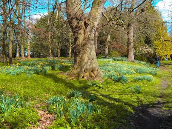
| Now lets run exactly the same 'Lab Sat'
action on
the drab image.
Only the daffodil's leaves are now green - the grass is now yellow (hue around 66). The flowers have now popped and there are orange centres to them (bit difficult to see in this small image). The main thing is that the greens have been pulled apart and now standout. |
 |
I'm not saying this is the bees knees, but I think the idea has potential and
certainly a blend between the original and this final LabSat+Hue change is
somewhere around the mark - way better than a standard LabSat. And yes I
know I should tone down the adjustments, but I like to see an 'over the top'
version and then tone it down.
So that was my first thought - what about t'other one?
![]()