Landscapes - End of part 1 - Next Idea
I've just got around to selecting and processing my photos over the Christmas period (well over a 1000 of them!).
| Here is one of them - the out of camera image on an overcast day, not a particular good shot, but I like our church in amongst the trees and snow. | 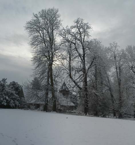 |
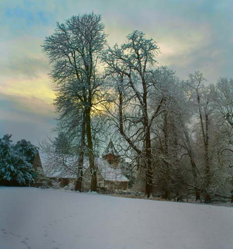
| And here is my PhArt'd version - just playing
to add some atmosphere to the image.
The sky is the interesting area, nice bit of yellow sun and then a strange band of pink before a green tint surrounding. I've left the snow with a hint of blue to emphasis the cold. But the centre section looks a touch pink-ish to me. But all is not what it seems... |
 |
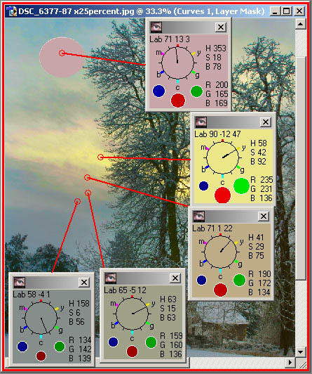
| I've added a pink blob in the sky because
that pink band surrounding the yellow is not pink at all - just look at
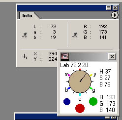
the hue clocks.
Pink has to have the channels in the order red, blue and green, and thus at hues to the left of 360 degrees. But that pink band is at 40 degrees, and then the next green band at 60 degrees (pure yellow!) and finally we get to the blue-ish cloud, which is green-cyan! What on earth is going on? 'Tis our adaptable eyes, making up colours that do not exist !
|
 |
So the point I'm trying to make is that measuring colour is sometimes an absolute waste of time. Like tones, it all depends on it's placement relative to the surroundings.
Post-processing by numbers will not always work - I've met this before with the interior of churches having perceptually green walls (to my eyes) that measure non-green.
| Along with the experiments with colour spaces, I now think that
it is better to use a Screen Hue Clock, rather than the Photoshop Info palette - but better still to
rely on one's eyes (assuming the screen is calibrated). That is true for
all my screen images; printed images have other problems, but I'm pleased
that normally the proof colours are pretty good at predicting the paper colours
and tones.
So I place them next to each other and get the best of both worlds! |
|
This is a complete upside down change from what I had been doing after reading Dan's books and the CurveMeister course. Neutral is probably the only colour (or non-colour!) we can reliably measure and believe in (and even that statement is likely to be wrong).
Phew! I need a rest for this all to sink in. I started this project two months ago and I think I'll leave it for a month before restarting and re-adjusting my analysis of the paintings.
![]()