
A Surprise Discovery
I saved all the toned images in jpg (from rgb), but the action to create the bands was done in Lab.
If I de-saturate the Lab versions they look okay, but the rgb ones come out all wrong! - in greyscale, the blue comes out lighter than the green or yellow. This must mean that, assuming the rgb conversion mimics the eye, the perceived colour brightness varies with hue.
I am self taught and perhaps I do not understand Photoshop modes well enough. The following was a complete shock to me - what do you think of these two renditions of coloured wedges?
|
|
|
|
|
|
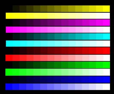
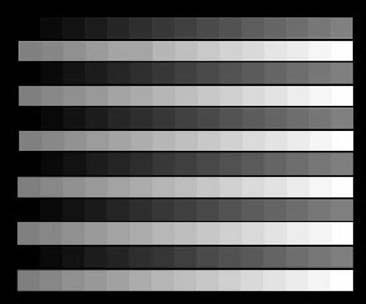
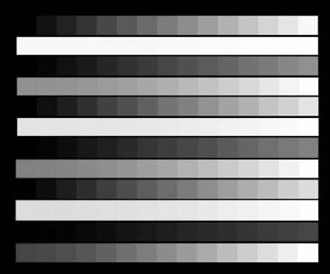
One is de-saturated (in rgb) and the other is the L channel of Lab (or Gray-scale Gamma 2.2) - completely different.
and just to rub it in...
 |
 |
 |
So never ever use de-saturate! (they are the ones on the left - in case you did not guess).
So I slight diversion - lets get back to tones.
![]()