
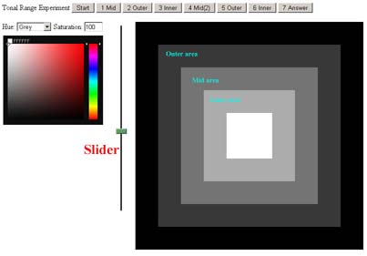
Tonal Experiment
As I am so confused, I thought it best to explore tonal ranges using my vision.
| I've bodged up this
experimental page (try it in a pop-up window).
The idea is to create the 3 tonal ranges within black and white frames, and also to try it with colour. To make sure the eye is not fooled by a black background, one also has to do it in reverse, with an outer white square. It is much harder than it looks and I got fairly appalling results! |
 |
||||||||||||||||||||||||||||||||||||||||||||||||||||||||||||
I did the experiment ten times over a period of a week, and these are my results, which show that with Munsell colours I am always on the light side of the mid-tone (result should be 50). With grey I tend towards the outside frame colour - by equal amounts.
|
|
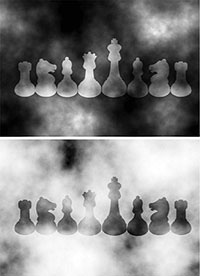
| We are easily fooled with the apparent tonal
value of an object, depending on its surrounding.
The opposite chess pieces are the same tones in both images, it is just the background that has changed - but we think the top pieces are lighter than the bottom ones. This image and the one below are from an excellent site explaining colour and our perception - worth a read. |
|
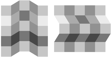
| In both the opposite figures the basic pattern is a 5 x 5 matrix of identically shaded achromatic "tiles", with the shape of some tiles changed in shape or orientation to create the illusion of a surface folded vertically (left) or horizontally (right). This is sufficient to produce contrasting spatial illusions and colour changes: (1) each column appears as a flat surface crossed by alternating bands of colour (left) or as a band of continuous colour at different angles to the light (right); and (2) the apparent lightness of any single facet changes depending on the spatial interpretation: compare between figures the second and fourth facets (both the same tone) of the middle column. These discrepancies are not noticed as conflicts or changes in colour: they disappear into the spatial illusion. The modelling of the folded surface, the idea of its geometrical form in space, acts as a scission template functioning across its entire surface. |
|
Bruce also says about COLOUR - synthesis of surface colours
The greater tension between "green" and "blue" reflectance, compared with "green" and "red", yields
a dominance order in the tinting strength of light:
blue > green [yellow] > red
Thus, green gold turns into yellow when the colour is lightened or brightened, and
yellow turns into green when the colour is dulled or darkened. In both cases, darkening the
colour is equivalent to adding "blue" reflectance to it.
So, at last, I know why the leaves on the trees were more yellow/brown than
green!
But why did I choose the Munsell colour space for this experiment?
![]()