

Colour Clock and Hue tester
I thought it would be fun to see if I could tell the time using a Hue clock, and then it occurred to me that I could also use it as a serious tool for testing how well I could distinguish different Hues.So first fun...
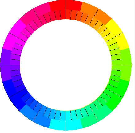
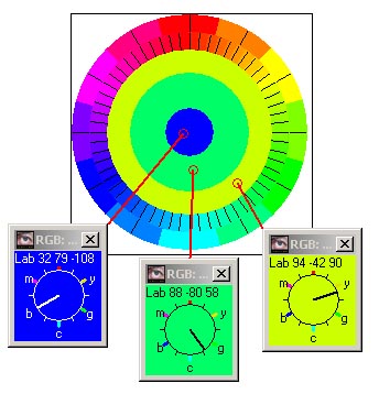
Here is a large view of the clock frame with the outer ring divided into hours and the inner ring into minutes and seconds. I normally run the clock much much smaller than this! Below I have added three instances of the Watcher to show that the clock is displaying the time at 08:24:12 |
 |
 |
You can adjust the settings to alter the Saturation and
Brilliance and have them vary over the 24 hours if you want. You can alter the tick rate (in case you
can not see the change each second).
There is also an Expert mode, which does not show the frame, so that you really have to know your colours to tell the time. And to make matters even harder, you can ask that the hour and minute colours change gradually rather than in jerks. For added amusement I've added a RGB and Lab variation - but Hue is really the best way to tell the time! |
Now the serious aspect...
We can run the clock in a slightly different mode to see how easy it is to tell changes in Hue - the whole clock changes from one hue to another at random-ish intervals. Unless you are perfect (i.e. a woman) and have an excellent display (i.e. expensive), I think you will not be able to tell all the Hues apart.
I've included three hue shift increments, starting with 12 changes (i.e. the same as the hours on the clock), down to seconds (or 6 degrees of change). Every time the clock changes hue you need to press any key (spacebar is easiest) to say you have seen the change, and then at the end it will display which hue changes you missed.
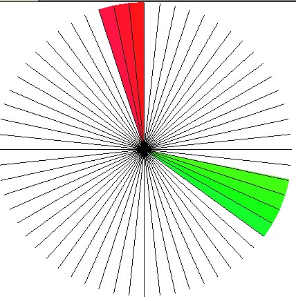
| Here is the result of my test run (where I missed 5 changes of colour, when it changed to 114 120 126 354 360)
- and my daughter had similar results (on my screen).
So presumably my screen is not too good on rich reds and greens. You can also run the test at different levels of Saturation and Brilliance. On an old laptop, even though it had been calibrated, the results were much worse and I missed 13 changes, with larger bands of red and green as well as rich blue and one magenta change. Note that I found it easier, if I set the background colour to white, instead of transparent, and increased the size of the clock to what you see opposite. |
 |
I think the results are quite important in how we adjust and see images on the screen - if we can not differentiate certain hues, then we either need a Hue Watcher to tell us different shades, or we can skip being too accurate!
If you think this could be interesting, then there is an option to email me your results and when I get enough of them, I'll add a chart (to this page) showing which hues are difficult to tell apart by people on their screens.
If you wish to use the program, just download it (virus checked by avast), unzip it and place the program on your PC (sorry it will not work on Macs) and create a short-cut to it. The program is completely free.