The Man from Mars technique
The Man from Mars technique is not about colour saturation, but colour separation or explosion - finding colours to add to the image (normally at pretty low Opacity). It is not a formula that will produce consistent results, but a visual tweaking technique.
The idea behind this technique is to pull apart the colours. The technique is not really predictable and you may wish to experiment with different points and colours to get the effect you are looking for.
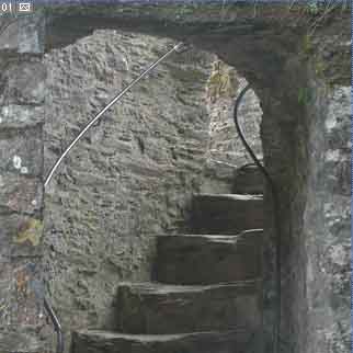
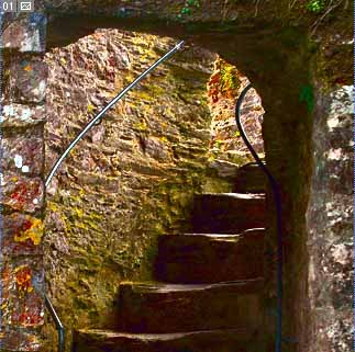
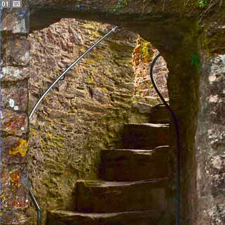
| Lets start with this fairly neutral image of a
stone staircase in an old castle.
I have cropped the original to show just part of it. Now the tones do not use the full range and there is a slight cast we can remove.
|
 |
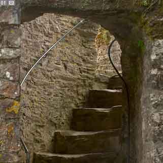
| While I was in CurveMeister, I also did a
'standard' Lab Saturation to boost the colours a bit. I prefer to
use Lab to saturate as it is so much cleaner than RGB, but you could have
done all of this with PS Levels/Curves and Hue/Saturation adjustment
layers in RGB.
Not bad (?), so perhaps we would accept this as a print? but... |
 |
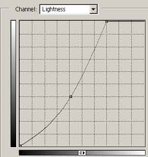
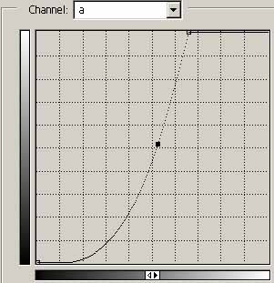
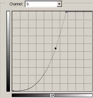
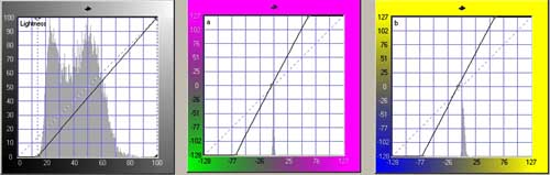
| Now comes the Man from Mars technique. In
Lab mode, we select points on the Curves to pull everything apart. Select mid-points for the tones and colours you wish to alter. Ctrl+click a point for the L channel and then move the top end of the curve half the distance along the top of the axis as shown opposite. The same sort of idea applies to the a and b channels, but this time find a neutral point (for that channel), or a colour you wish to split. When you have Ctrl+clicked a point (for each channel), then move the top of the curve to the left until the bottom just starts to bottom-out and kiss the axis. You should notice colour being introduced as you do this. Using a 'kiss' instead of a straight line, means that the warm colours will explode more than the cold ones. |
 |
 |
 |
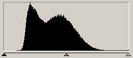
| The result is quite 'wild' with all the
colours popping up all over the place. One would not have guessed
that there was so much in the original image - look back at the Lab
channel histograms and they are hardly visible. The Opacity needs reducing to suit your taste - I've left it high at 50% in the image below to show you an exaggerated difference between it and the original one we started with. If you want to play in your preferred colour space with this image here (2k) is a larger version. All impressive stuff, which would be very hard to do in other colour modes, but it only takes a couple of ticks in Lab. So that's another good reason to learn about Lab and start to use it in your image processing. |
 |
 |
|
But what about if you start with a colourful image - is the technique still useful - yes!
See what can be done by