I just love this hobby of photography and I'm delighted with
the amazing things one can do in Photoshop.
As there are not many people
around here I can share with, I thought I'd share my passion, via this web site,
with you.
Also being new to this world of post-processing and not really understanding
colour (channels) and tones, I'm thrilled at how much one can achieve using Lab
mode compared to RGB - it is the difference between juggling one ball at a time
compared to two+, and so quite a few pages are devoted to how easy and powerful
the Lab Colour space is.
These pages have grown over time and some of them are rather
naff, as I put things up as I learn them, so you will have to pick and choose
what is worth looking at!
If you wish to pick from an expanding menu, then
click here
Before you continue – are you seeing what I’m seeing? Can you see
the full range of 16 evenly spaced grey boxes?

And how about this image – you need to move back around 3-4 feet for a CRT
screen and 2-3 meters for a LCD screen (and even then you may have difficulty
getting the right viewing angle!).
If you see a band down the middle of the columns, then your gamma is not at
2.2 (best for the web and most cameras) - if you are using a LCD screen, then
notice how it changes as you move your head around.
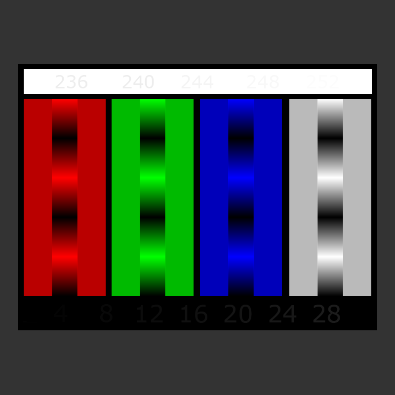
Now looking carefully, close up, you should be able to read the numbers 248
and 252 in the
top right corner of the white bar and the numbers 8 and 12 (even
4 if you have an excellent screen) near the red/green bars in the lower black horizontal bar. The background and the grey patch should be
neutral grey.
If you cannot see these numbers, then your screen is not showing shadow and highlights
properly.
Does it really matter that we are not both seeing exactly the same tones and
colours? Well yes and no!
If you are only ever going to look at your pictures on your screen, and do not
mind that your the prints are slightly different - then leave things as they
are. If you have a laptop, compare it with another screen (both showing
the same picture). If the colour difference is small, then live with it.
However if your prints don’t look like your screen, then the best thing to
do is to adjust it. Think
of the problem as the screen's White Balance. You know if the camera's White
Balance is wrong then your picture comes out with a tint in it - well the same
is true for screens.
I could never get photos of people to print correctly, the faces were always
too red - it was very frustrating and so I rarely printed anything and if I did,
then it took me ages trying to correct them. In the Computer Related
pages I show you how to adjust the screen's Gamma - and then your screen will be
properly balanced. By the way if you run a Mac, then this need not
apply to you, as the Mac gamma is initially set at 1.8!
Incidentally, you can save any of the images, by right-clicking on them and
selecting Save Image As…
So please enjoy the rest of my pages
and email
me with any questions or comments
to
chris