|

| |
|
So what about adding saturation - I probably do that on most photos.
Here are 2 sets of the darker boxes, again trying to keep the top face the
same for each type of change.
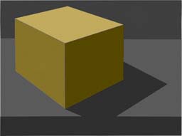
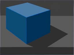
| Original |
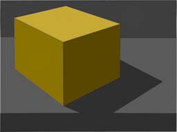
Lab Saturation |
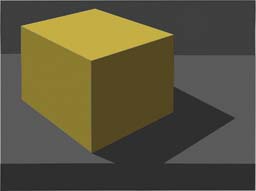
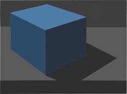
Lab Sat + L channel mask |
Munsell faces |
 |
 |
 |
 |
 |
 |
 |
 |
| |
|
|
|
These are quite large saturation changes and there are differences, but
the L channel mask does not help as much as I thought it would. How
about real life?
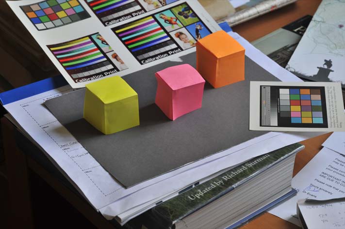
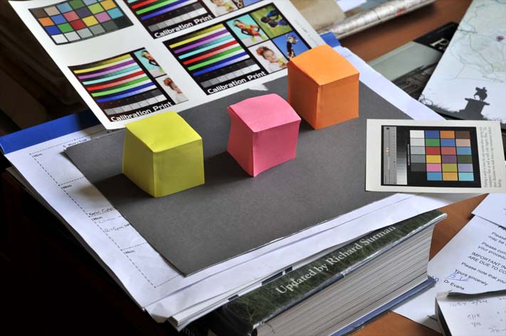
| I constructed 3 boxes from Post-It notes and took a 5 (1ev)
bracket shot of them. Here is the 0ev one. Now cameras
automatically adjust the image to give an out of camera 'good' photo
by increasing the contrast etc. This means that the original
colours I saw will be different in the photo.
Note in the following, I have made an assumption (which may be
wrong) that in-camera adjustments are carried out in Normal blend
mode, rather than Luminosity mode because that results in a more
colourful photo.
When Reilly was talking about chroma adjustment, he was referring
to the painting real-world image, not a photo rendition of an image.
But then we will be looking at the photo, so that becomes the
real-world image! |
 |
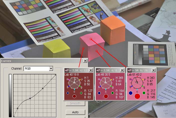
| As I had taken a bracketed set of photos, I was able to stack them
up in layers and add a curve adjustment layer to correct the 0ev image
back to what was actually taken - because each shot was 1 ev apart and
I could use the grey card to deduce the correct luminosity of each
stop. Opposite is the curve needed and the Watchers showing the
difference between the out-of-camera (surrounds) and real-life (colour
inside the clocks).
I had also checked the level of each face using the spot exposure
meter and the pink box measured 1/13th, 1/25th and 1/60th, which is
roughly 1 stop apart - so that ties in with the curve adjustment
levels of 40, 48 & 61 (compared to the photo's 31, 42 & 61). |
 |
| Nearly all post-processing starts with setting the shadow and
highlight points, unless we are after a non-punchy image. These
points are set depending on what we are prepared to loose at both ends
of the tones and is therefore unpredictable for each photo. We also
tend to correct for white balance at an early stage.
Thus we now have a rendition that is likely to be quite different
from the real-life image. It is this image (shown opposite) that
I shall experiment with.
Whether things improve with Reilly's approach, or not, will not be
a proper test of his idea, just using a single example. |
 |
| Without knowing how things will evolve, I plan to take
two approaches to test the chroma. One involving the above image
and another with a processed version of it, increasing the saturation
and maybe the contrast. |
| So first changing the chroma for the above image.
There is not a whole heap of difference, but it is there and I feel
that it makes for a 'better' orange box and changes the flavour of the
pink one.
The yellow difference although too small to write home about for
the two vertical surfaces, does seem to have changed the horizontal
one - but that is all in the beholder's eye, they are the same. |
 |
| Now let us complete the post-processing (of the image but one
above) with extra contrast and colour saturation. |
 |
| and if we alter it for Munsell chroma. So I think it both cases
less chroma won the day. |
 |
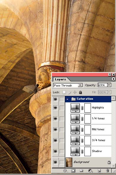
I did a series of tests on random images by adding a L
mask during saturation increase and also following the Reilly
formulae.
In the main, images like the example opposite
tended not to significantly benefit from either technique, but
photos with large contiguous areas in a tonal framework did, like
the one below.A Thought
Painting in Munsell colours is time consuming,
but quite effective. An alternative to the L mask (and
quicker to do during processing) is to create a Layer Set with
(say) 5 tone stops (controlled by BlendIfs), each with a different
saturation level. Going from the bottom layer, I find -20,
0, +20, +30 & +40 saturation boosts a good starter. I can
then alter the Opacity of each layer as well as the Layer Set.
If I keep this Set in a small .psd file, then I can quickly copy
it to the image I am processing! Needless (?) to say this is
all in the Lab colour space. |
 |
|
 l l |
 |
|
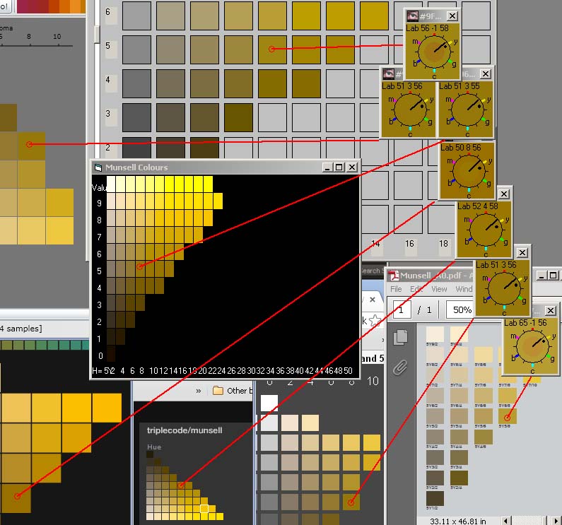
Post Script
Finally I just want to emphasise the problems in displaying Munsell
colours on a screen.
Below is a screen snapshot of 7 different
programs/pdf files showing the 5Y swatches.
When I display the Munsell colours from the
Colour Watcher, I do so using a basic Microsoft screen write.
I would be very surprised if this write pays any attention to a screen
profile and it certainly has no colour space tagged to it should it be
saved.
| So I have no
idea how far out the colours are from the real (paper) Munsell
swatches, and it is always hard to compare paper to screen renditions.
What I do know is that if you take a screen snapshot and re-display
it, the colours will be different - just use the Hue clock on this
snapshot to prove it.
Having said all of the above - the differences are small, but they
are present, so take nothing as gospel. Anyway what value colour
are we seeing? Certainly not the file value or the screen value
- it must be our perception value, and that is hard to measure!
It would seem that
Lab 51 3 56 is probably the correct colour for 5Y 5/8 swatch and the
Colour Watcher agrees - Phew!
The top and bottom clock value show colours which are way out - so
beware. |
 |
| |
So add a pinch of salt to all of the above... |
|
|