|


| |
Shadow colours and Munsell Colour Space
The whole area of colour perception as luminosity changes is an area that
has interested me for some time.
Dan Margulis noted that painters used less colour saturation in the darker
tones than in the lighter areas of a painting and suggested using a mask,
normally the Luminosity channel of LAB, when adding colour saturation during
post-processing.
My difficulty in differentiating (especially green) hues in the
Colour Clock experiment and
the findings from the Learning from
Masters project, reinforced the idea that the
Munsell colour space is a
serious contender when manipulating images.
Sammy Lee brought to my attention the advice by
Frank
Reilly to painters on how to mix colours as the object became darker.
Basically, as an object colour in a scene being painted becomes
progressively darker, its Munsell value, not surprisingly, decreases. The
rule of thumb says that the chroma also decreases, by about the same amount
proportionally.
Although it seems counterintuitive, the hue of a shadow is not nearly as
important as its chroma. As the shadow becomes darker, and the chroma
decreases, the hue becomes nearly indistinguishable.
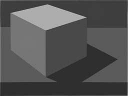
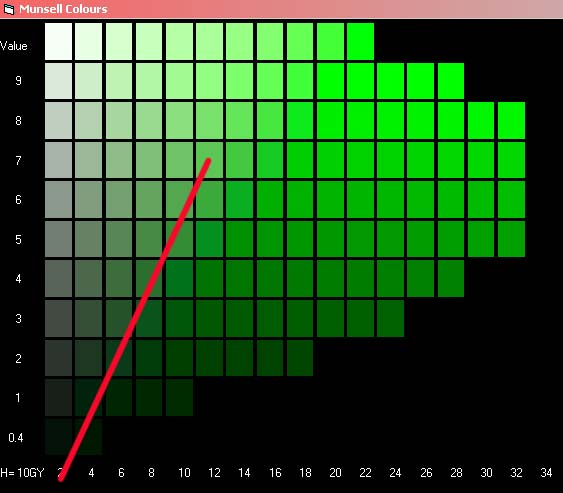
| Paul Centore has
written an article that explains all this, but in a nut shell it
says... Suppose that the colour when lit has Munsell coordinates H
V/C
For example 10GY 7/12. The left axis is a vertical line of
neutral greys, numbered from N1 through N9. Continue the neutral axis
downward, to where the value would be -1.
Draw a line from the value -1 on the neutral axis, to the center of
the square
containing 10GY 7/12.
The shadow colours of 10GY 7/12 fall on this line.
This is obviously approximate as the chances of a colour exactly
matching a Munsell swatch is not that high.
|
 |
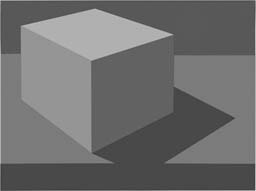
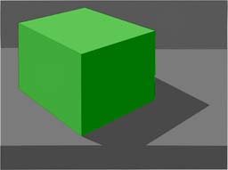
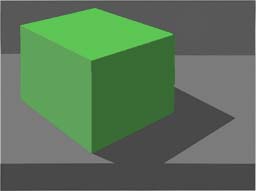
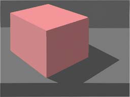
| First we better see if this theory holds true for
Photoshop images. |
Now that we agree (?) that the Chroma change looks much more realistic,
lets see what happens if we make changes to the luminosity. This project has been about shadows, but
what about the reverse! What happens when we lighten shadows in an image?
I find this is a fairly common adjustment that I make to photos.
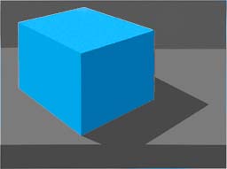
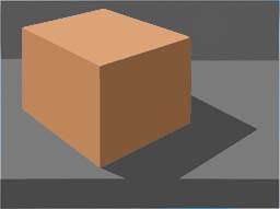
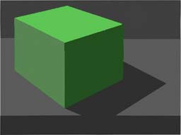
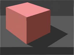
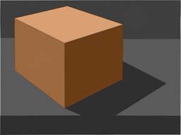
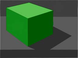
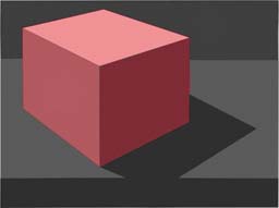
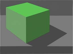
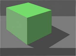
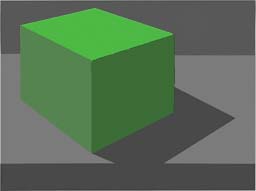
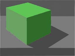
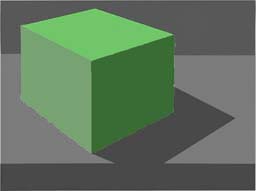
So I will attempt to alter the second darker faces (N5 & N3 - Lab
51&31) to bring them back to the lighter ones (N6 & N4 - Lab 62&41),
keeping the top face (N7 - Lab 72) the same as far as possible. In other
words increasing the shadows by 1 stop (of exposure). I have masked
out the background from these changes to aid comparison with the original
lighter box.
The results remind me that I should always post-process in the Lab
colour space. They say Lab is a bit of a "bull in a china shop", but
I cheat using CurveMeister to display curve dialogs over 3 times bigger
than the large photoshop ones, on a second hand-me-down old LCD screen, so
that I can do quite delicate adjustments.
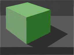
[Light box answer is bot,bot,top,bot and the darker one top,top,top,bot
for the Reilly/Munsell image]
When comparing these image on 3 different screens, only one of which
was calibrated, the differences in one case were overly pronounced.
So the effect one creates may not be obvious to others who view your
images on their own screens - obvious really, but worth remembering.
|
|