Actions - 4th year
![]()
![]()
![]()
![]()
![]()
![]()
![]()
![]()
![]()
![]()
|
Actions - 4th year
|
|
This page is basically for me, to backup, document and remember what I learnt, but it may be useful to you too! In addition to my actions I am now using more external programs to help me process my images. I've already mentioned the fantastic NeatImage, FocusMagic, CurveMeister and PTlens but for my latest project I am a fan of EnfuseGUI, which you can download here. When I take photos of churches (my current long term project) I take 3 exposures (normally -2ev, 0 & +2v) and use to layer them together and paint on masks to bring out the detail, but now I let EnfuseGUI do most of the work. Sometimes I will still layer the exposures to emphasise different areas. An alternative product, but it requires fiddling with the levels, is Qtpfsgui (or Luminance HDR) which can include a image alignment step (via Hugin) - but I think it is quicker to use CombineZ to align images that are the odd pixel out. I also tend to take panorama shots, still bracketed, if I want more detail and I find AutoStitch program much easier and quicker to use than Hugin. So this image consists of 22 exposures, which I Enfuse, in blocks of 3 exposures, and then AutoStitch them together. You can then play with projections using this amazing Panini program which is a mathematical rule for constructing perspective images - named after the work done in 1754! Isn't it fantastic what one can now do with digital that was absolutely impossible with film. To display these large images, I use a free version of MagicTouch embedded within the free JAlbum program, which I've automated with this wee program (if you want a copy that will work for you, then drop me a line). Perhaps, more importantly, I've added some actions as a result of my 16th C project. I'm self-taught, so it may be a load of rubbish, but in order to manipulate images to steer the viewer's eye into the scene I think there are two areas that need careful adjustment, over and above the 'standard' post-processing steps (and of course they should never be inter-twingled):- Grey scale tones, both overall for composition and in specific areas to add emphasis - remembering that we can fool the viewer depending on the surrounding tones
Colour hues to differentiate and add impact to the image by colour tricks/illusions
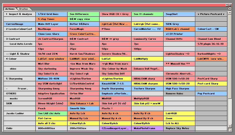
If you are not comfortable with the comments I made on my second year page - forget this lot! - as there is little explanation. As before click on a heading to download an action set, or click on the action name to see the steps of the action (in a new window). I've changed the comments to usage rather than technical detail (which you will mostly find in year 3).
note only Inspect (5 Stop Tone, B&W copy view), Levels (PTlens & colour casts), Colour (Man from Mars & Munsell Hue) & Contrast (option added to Local Auto-Levels to copy back set to original image) have changed from year 3. Post-processing is now much easier by having two monitors (even though the 2nd one is not calibrated and is a cast off from my son!). CB4Actions-Inspect
CB3Actions-General
CB4Actions-Levels
CB4Actions-Contrast
CB3Actions-LightShadow
CB4Actions-Colour
CB3Actions-Sharpen
CB3Actions-Others
CB3Actions-Skin
CB3Actions-JacobsLadder
CBsActions
|