|


| | Photoshop Actions
This page contains a basic 'toolkit' of downloadable Photoshop
(photographic)
Actions which you will
find useful
to
improve your pictures and fix most of those annoying problems.
You can either run them 'blind' or try and
understand how they work. They are aimed at improving snapshots as
well as more serious images.
You will find that by just running the right Action (at the tight time!) you
can improve most of your pictures almost without having to do anything else. The
exception is the initial adjustment to set the full tonal range of the image -
so you need to do Image>Adjustments>Auto Levels (I'll show all
Photoshop menu selections, and specific features, in italics) at a minimum, but
really you should adjust them yourself, with Levels or Curves, to get better results.
However as well as fixing things it is equally important how you
go about it. I therefore describe a method to ensure that you get the best
possible results regardless of which Photoshop facility or Actions you use.
An image is made up of two attributes, ignoring the subject
and composition etc.:-
Tones
Colours
Unless, tongue in cheek, you are a woman who can do two things at once, it
should be fairly obvious that we have more chance of success if we do one thing
at a time, especially if we are not experts, rather than try and adjust
everything at the same time. Thus we should tackle the tones of an image independently
of the colour. Back in my early days of photography we used various
filters to enhance the B&W pictures we took to increase the contrast (tones)
of the image in the areas that were important. So for important images,
try and correct Tones first and then adjust for Colour - doesn't matter too much
for snapshots, but getting into the habit of a structured order of doing
adjustments is not a bad thing.
I find PhotoShop Actions extremely useful - not only to repeat tasks, but
also as a way of doing things that I might forget. There is an additional
benefit that trying to work out how an action works will help one learn
post-processing techniques. For instance the Improve Weak Sky
action (which works without selecting the sky!) becomes obvious when you
start looking at the Red channel of landscape images - but that is a
little more advanced and we will tackle that later.
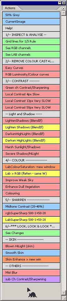
| The Actions are grouped into a simple but effective order,
or Work Flow, preceded by some general useful ones that could be used at
anytime and other specialised ones at the end. The real intention of
publishing these Actions is for our local PhotoGroup and we will add more
advanced Actions in the future. These Actions do not address the
problem of colour casts, which is a difficult area, we'll deal with later. |
1 Inspect and Analyse
2 Colour Cast + Levels
3 Contrast
4 Colour
5 Sharpening
6 Look, Look and LOOK
|
Let me say again - You have more chance of getting the best out of your image
if you do the changes in a pre-defined order; for instance sharpening should
always be the last step and paying attention to contrast should be done before
enhancing the colours. So try and follow this order, even if you do not
have to use any of the Actions!
Most of these Actions will "over-do" the effect, so
that you can/will alter the Opacity of the Blend to suit.
Some may require Masks or BlendIF changes when there are side
effects on bits of the image you don't want altered.
Here is an outline of what they do, and sometimes there is a
"[more]" link, which will popup a window giving further details,
examples and sometimes a little help on using them...
General
| 50% Grey [more] |
This is
just a quickie to create a Dodge and Burn layer in Soft Light
mode - painting Blacks darkens and
Whites lightens. 50% grey does nought. You can change
the Blend mode to Overlay for more effect. |
| CurrentImage |
Another
quickie to create a new layer, into which is placed the current visible image
(i.e. merging all visible layers, but not flattening them) - useful before
making your own changes. [equivalent to Ctrl-Alt Layer>Merge
Visible on a new empty layer]. |
|
1/-- INSPECT & ANALYSE --
| Grid lines for 1/3 Rule [more] |
Creates a
transparent grid to help CROP an image, if you consider the
rule of 3rds to be important. Use Edit>Tranform>Scale
to move and re-size the grid. The very first step should
consider the final composition of your picture - so this action is
here to remind one to do just that! |
| See RGB channels [more] |
Shows the
3 RGB channels side by side, which you can do equally well with the
Channel Palette - but this is a reminder to ANALYSE before
starting the Work Flow. |
| See LAB channels [ditto!
more] |
Ditto as
above, but for the 3 Lab channels |
|
2/-- REMOVE COLOUR CAST + LEVELS
| Easy Curves [more] |
This is a short cut to the Windows SmartCurve plugin
(a free download here) which combines
dynamic histograms with Curves and
also allows one to curve in any Colour Mode from RGB - it's
great for learning and has some excellent features (not in PS),
which are explained in its help. The only downside of using
this is that the result is not an adjustment layer, but I've
placed it on a normal layer instead. SmartCurve gives one the
option of remembering the curve, so you can come back and reload it
before making further adjustments.
Extract the files and put them into the plugin directory of Photoshop
[something like C:\Program Files\Adobe\Photoshop 7.0\Plug-Ins].
If you are getting into different colour modes and want to
understand channels and the effects of adjustments, then can I
recommend (!) ColourWatcher -
I find it invaluable as I learn more and more (run it one or two
magnitudes larger than the start-up size [Cntrl + "+" key] to
exactly see the channels).
|
| RGB Luminosity/Colour curves
This is a VERY important idea - so read a
little [more]
|
Gives you 2 adjustment Curve layers, so you can
isolate the changes you make instead of altering RGB colour as you
change Levels/Curves.
Remember that moving the top end of the curve (assuming it is the
white end) to the left and bottom end of the curve to the right, is the same as
moving the 2 end sliders of Levels. Moving the mid-point
diagonally (to top left/bottom right) is equivalent (well almost) to
the mid-point Level slider. |
|
3/-- CONTRAST --------
| Green ch Contrast/Sharpening |
'Standard' Dan Margulis action from this new '07
workflow - probably something you wont want to use until you get
into inspecting channels. It is a subtle effect and works most of the
time, but some images should use the Red or Blue
channel instead. |
Local Contrast 4px Slow
Local Contrast 13px Very SLOW [more]
Local Contrast 50px Very SLOW |
A fantastic idea and very effective on dull images -
equivalent to doing AutoLevels over differently sized areas of the
image rather than the whole of it. You need a maths degree to
understand it - watch for halos. This
explains all! If you wish to add other ranges, then the Blur radius should be 0.7 * min/max radius
and the HighPass filter radius is the same as min/max radius.
Make a cup of tea for sizes over 13pixels (well certainly on my old
slow PC), but well worth the wait
for the right image. |
|
-- Light and Shadow -----
| Lighten Shadows (BlendIf) [more] |
Simple Screen layer with BlendIF settings of 0 ,
0/255. |
| Darken HighLights (BlendIf) |
Simple Multiply layer with BlendIF settings of 0/255,
255. |
| Harsh Sunlight/Shadows [ditto
more] |
'Standard' Dan Margulis action using Luminosity.
But, for example, in flesh tone images, making a selection based on
the red channel will probably work better. Watch for halos and
you may need to apply a curve to restore the full range. |
| Severe Shadow/HiLight [ditto
more] |
This is quite crude, but does not produce halos. |
|
4/-- COLOUR -----------------
| LabColourSaturation - new window [more]
- or see the Lab page |
A must for colour - 'Standard' a and b channel
steepening. |
| Lab > RGB (flatten - same Window) |
Quickie to help apply the result of the above back to
the RGB image (to place the result in a new layer on the original
image, hold the shift key as you move it - you can
then delete the copy image!). |
| Improve Weak Sky [more] |
Should always improve a weak sky. Watch for
noise in the sky and adverse effects on other areas of the image,
which may need Masking. |
| Enhance Dull Vegetation [more] |
A Dan Margulis suggestion, which normally works, but
may alter other colours, so inspect carefully and follow the
instructions! |
| Colouring |
A Color Dodge layer for painting in some
colour. |
Regretfully we can not
automate the "Man from
Mars" technique, but if you follow the link it may give you some
clue how to do it.
|
5/-- SHARPEN ------------------
Sharpening is a very subjective adjustment and is very dependent on the
picture content - so just experiment with these...
| Midtone Contrast (20-40%) |
An excellent Action, giving just that special bit of
'lift' to an image - some people always do it as the last
step. Opacity should be in the range 20-40% - and watch
for halos. |
| rgbSuperSharp 500-1+50-20 |
Two applications of Unsharp Masks of 500%,1px and
50%,20px both with a Threshold of 2, applied as a Luminosity
Layer - effect will need reducing. |
| LabSuperSharp 500-1+50-20 |
As above but only on the L channel - this is cleaner
than rgb. |
|
6/--*** LOOK, LOOK & LOOK ***--
| See Changes [more] |
A 'fun' idea to remind one to check to see what
has changed - shows the difference (in a new window) between
the initial Background layer and the CurrentImage.
Adjust the Levels slider if necessary. |
|
-- SKIN ---------------------
| Blown HiLight (skin) [more] |
A Dan Margulis suggestion to ease blown highlights,
will work on any blown highlight surface - don't
pick a skin tone too near the blown area. Subtle and much better
than pure white, probably the best that can be easily done with this
problem. |
| Smooth Skin |
Really just for portrait shots. Lower Opacity to
reduce the effect and may need subsequent masking of light areas in
the image. |
| Skin Enhance > new win [more] |
A Dan Margulis suggestion - absolutely beautiful for
faces, reduce Opacity of the 2 layers a lot, as they are
left way too high. |
|
-- OTHERS ---------------------
| Mist Blur [more] |
Two effects in one - either a Gothic type blur, or at
a much reduce Opacity a glow-warming effect. One to play with. |
|
 |
To have read so far, I reckon you must be moderately serious about improving
your images and learning new techniques - well for starters did you know that
you can get a text copy of the Action steps by selecting an Action set (when not
in button mode) and holding down the Alt and Cntl keys before, and
while, you select Save Actions - I find reading these steps helps
understand what is going on.
All things being equal, I plan to add some more advanced actions and
techniques in the summer of 2008 that should improve and speed up ones workflow
in adjusting your photos - why? Well apart from the fun of sharing
knowledge and helping people, the act of having to explain what and how
something works helps me learn (and remember) - so we both gain, it's a win win
situation! - here is the link to easy colour
correction.
If you are fairly serious about post-processing,
then these tools may interest you.
Have fun! If you have any questions about these action then just send an
email to chris
|
|